When a website seems simple and clear to deal with, it is useful, and its content becomes a crucial matter. Therefore, while beginning a website and developing the current one to a better status, it is essential to do pre-work. It involves one issue which is of the highest importance – establishing definite goals which can be later modified into a successful website.
Our Web Design Company is featuring the most productive ways of simplifying your design and put your website on the level of topmost usable ones.
If you want to learn the art in web design and are excited about having a significant number of satisfied users, look at the following advice pieces developed as logic direction on websites’ simplicity.
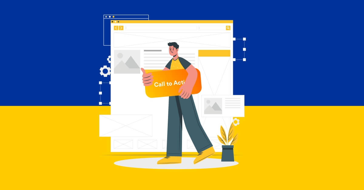
Call of action as an essential part of web mastering.
If a user opens a web page, they are amenable to find the picture of his purpose there. Keep in mind that your website has to include a clear objective for a user’s motivation. ‘Calls of action’ have to be easy and simple. It does not imply insignificance of expressions, a just short statement with an engaging design and centre is an ideal choice.
Keep updated.
If a user clicks over around seven pages and finds outdated data, he will be disappointed and nevermore hit this web page. The subject of numeration also appears here since the content with disorganised manner is not engaging and simple. Create as few pages as possible but place everything in an approachable style.

Act as an artist.
The colour pallet is deemed to be an essential tool for drawing and entertaining people. The only major thing to keep in mind is that there is no obligation to overwhelm and make your page super-colourful. If you want to maintain integrity, make your webpage in a monotone colour palette. But, remember highlighting the most relevant information or data and updates on your website. It is stated that fewer colours do not intellectually burden a user so that such a carefully built website creates the suitable and well-organized impact.
Be user–friendly.
Easy navigation is indicated under this title. It is popular to hide or reduce the general appearance of options, but an average user needs fast navigation and easy site management, to be honest. If you desire to show off with modern and cool navigation, be prepared to face the reality that users are reluctant to do extra hard work to find a particular element. Moreover, the simpler web design is, the simpler it is to use it on a mobile phone.
Adhere to the ’80-20′ rule.
If you need a piece of advice on how to enhance the current site, this rule is unquestionably for you. Any changes in the design must be more exceptional but, at the same time, easy and user – friendly.
Be prepared to take in that 20 per cent of the issues on a site are 80 per cent of what users need. The simplistic interface will enable you to fill your web page with the most significant information.
If you rethink a design, focus on the stated 20 per cent since they determine the topicality of the content. However, keep in mind that 80 per cent are inactive influencers. They do not immediately address a user, but they are remembered on an unconscious level of a man’s understanding.
Use the smart interface.
Everything you give your users has to be significant, particularly about UI (user interface) components. All the symbols or hypertext has to be flexible. Avoid owning any icons which are not helpful for users. For example, remember those moments when you click on an icon, but it does not reply. Bothersome? Is not it?

Be accustomed to the typography.
Regular shape and colour, consistent stroke widths, no abundance of ornaments are the most straightforward and most fashionable web design features. However, if you want to highlight something, you may use particular lettering, which is exciting and visible.
Consider the layout of the canvas.
A well-built web page is the one who is mobile in terms of obtaining information. It is helpful if you may put everything on the only page using an ordinary laptop screen. Consider other devices which also need wisely created content.
Communicate discreetly.
Although you do not have face-to-face discussions with users, you interact with them. The expression of your web page has to be vivid and proper. Determine your target audience; it will help you to pick the language. For example, if you are ready to offer content to the youngsters, do not hesitate to use slang or phrases. It will keep you on the equal drift with them.
Do not be hesitant to push beyond the boundaries.
Rules are dominant, but they are not directed at making you, a web designer, original.
It is worthy of following the directions which are examined from the position of a user. Still, modern people want a fresh spur to begin their business, set up a brand, enrol on a webinar and so on. Identify your niche which will encourage a user.
As far as we know that personal income in web designing is a critical element since you are much talked about, you are an essential part of the web interface. Develop your style of approaching the users, which will make them wait for the next visit.
Get an amazing website design with the support of Next Screen Infotech Private Limited today!
