Are you looking to boost the online traffic to your website? If you are, then you should consider doing it by banner ads. There are a lot of things that you can do to create a banner ad design that people will prefer to click on. The web banner design focuses on making effective banner ads.
Here are some banner ad tips suggested by graphics design company that you should follow to create banner ads that can get maximum clicks.
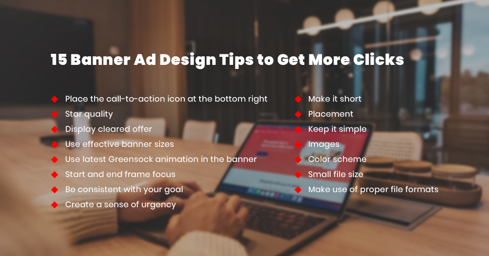
Place the call-to-action icon at the bottom right
The call-to-action is an important element of the banner design, and it should be placed at the bottom right of the banner. This is where the eyes of the visitor usually end at. Phrases like ‘Learn more, click here and register now’ should make your visitors click on it.
Star quality
Use star quality in your banner ads whenever possible. It is sure to deliver you more than 40% clicks as compared to the normal quality banner.
Display cleared offer
The offers, discounts, or special deals should be mentioned clearly in the banner ads. Phrases like 50% off, handmade, locally made, limited time offer, or buy one get one will attract the attention of the people.

Use effective banner sizes
Your banner ad should be well coded to be seen on the system. As per Google AdSense, the best banner sizes are
- 728×90px — Leaderboard
- 300×600px — Half Page
- 300×250px — Medium Rectangle
- 336×280px — Large Rectangle
Use latest Greensock animation in the banner
The animated banner ads are better than the normal ones. You can use GreenSock Animation Platform (GSAP) to create banner ads that are reliable, fast, and high-performing in major browsers.
Start and end frame focus
People usually remember what they see at first and what they see the last. In the case of banner ads, it is the start and end frames. Make sure to keep all the important elements at the beginning and the end.
Be consistent with your goal
Always maintain the same goals in your banner ad. If you want to sell low price products, don’t display luxurious items, or else the audience might find the products to be expensive.
Create a sense of urgency
Use bold yet contrasting colors to render a sense of urgency in your banner ads. These things will catch your attention and speak about your brand. It will, in turn, make people click on the link.
Make it short
The elements that are in text format in the banner ad should be minimum. Ideally, within 50 characters and the space between each word. Visual simplicity is necessary so that viewers can read it within seconds.
Placement
But the space of the website houses the main content of the page. In this way, it becomes hard for visitors to ignore the banner ad.
Keep it simple
Don’t add unnecessary elements like excessive texts and pictures. Make sure to deliver a clear message to the visitors.

Images
Use images whenever necessary, but use simple and high-quality images only. In case more space is available, it’s good to add some graphics and illustrations.
Color scheme
Different colors represent different emotions, so it becomes essential to choose colors wisely. Please ensure that you work in view with your target audience before you create the required effect.
Small file size
Your file and your ad will load quickly if you keep the size of the banner ad small. Large files don’t load soon, and the viewer scrolls down and misses your ad.
Make use of proper file formats
The standard file formats are JPG, PNG, JPEG, GIF, and HTML5. Don’t make use of flash ads, as they’ve become out of date now. These are the top 15 tips that can surely help you to create proper banner ads. We at Next screen provide graphic design services at affordable prices, and you can reach out to us to make the best banner ads.
