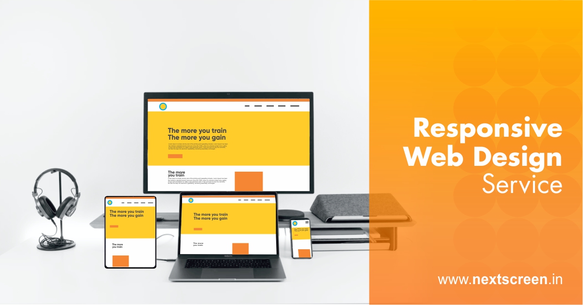
With the launch of the mobile-first indexing in March of 2018, Google made it clear how significant its mobile user-base is and how it plans to concentrate on serving them better in the future. The mobile-first index primarily considers the mobile version for ranking among its search engine result pages.
The crucial factors for ranking better in a mobile-first index setting are responsiveness and speed. Here’s how a responsive web design service improves these factors.
1. Add a Viewport
Every web page, including even the most basic one, must have a viewport. A viewport is a critical tool in enabling multi-device experience, and without one, sites struggle on screens belonging to anything other than a desktop.
The function of the viewport is to indicate to the browser that the respective page needs to be scaled to fit the screen of the device. Adding a viewport is relatively easy as it only needs to be mentioned once in the head of the document. It is also advisable to start with a narrow viewport and scale out later.
2. Future-proof your Website using Breakpoints
While viewports are the foundation of responsive web design, breakpoints are the supporting structures that the rest of the website structure depends on. Breakpoints are basically browser widths that have a media query declaration to change the layout once the browser is within the specified range.
Most responsive websites have an average of two breakpoints, being employed for tablets and mobiles. The screen sizes of iPhones and iPads are takes as standard while setting these breakpoints as they’re the most widely used devices. However, one can go the extra mile and incorporate custom breakpoints based not on device but layout for future-proofing the website in the long run.
3. Use Media Queries
An essential tip for websites lacking a responsive theme or having an HTML/static website is to make use of media queries. A media query is nothing but code in a stylesheet that instructs the browser the way the site needs to be displayed in different resolutions.
The websites can become more responsive by leveraging the ability of media queries to implement distinctively targeted styles for individual device and browser circumstances. The styles even change dynamically depending on the features of the device the content is viewed on, including the width, display type, orientation, and height.
4. Make Images Flexible and Workable
One way to deal with images in a responsive design is to employ variable breakpoints and store multiple image sizes in the data for different screen resolutions. But this responsive design element can be a handicap for speed as it increases the bandwidth. Devices not having access to a powerful bandwidth can take forever to load the website.
Thus, a better alternative is to make the images flexible by using adaptive sizing and resizing their width. Handy tools like ‘Adaptive Images’ can be used to achieve this with relative ease. It is also advisable to size the images according to mobile users for an overall responsive and fast website.
5. Content Management
For responsive design, replicating the desktop version of a website for a mobile device can be deal-breaker for users. The mobile experience should be much more focused on user-friendliness by managing content in a more streamlined way.
For example, mobile website content should not start with a large header image as users will be forced to scroll down for the reading. As mobile devices interact using screen touch gestures, the Call-to-Action and navigational buttons should be significant and distinctive enough to prevent accidentally triggering an unrequited response because of a ‘miss-touch’.
Mobile devices are getting faster than ever, and with a host of options, users don’t hesitate in switching to alternative results in the blink of an eye. Use the tips mentioned in this article and work with a reputed responsive web design service to retain users for better rankings and ultimately a higher ROI.
