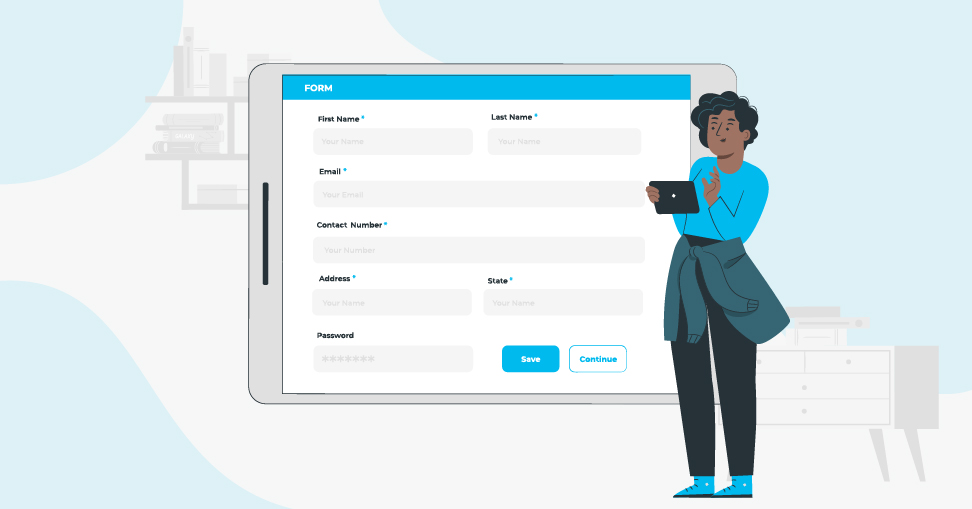
Web forms play an important role in daily web use. If you create and/or manage websites, possibilities are you could have a web form, whether it’s a basic contact form or a rich and diverse web app. There are many ways to ensure that your web forms are user-friendly.
Here are some pointers to make your form submission process more user-friendly.
Emphasise the required fields.
It’s inconvenient as a user to offer up a web form only to discover that you’ve overlooked requisite input fields. An asterisk (*) next to their label is a prevalent convention for outlining required fields. It’s a good idea to state explicitly whether an input field is needed or optional.
Focus on providing error messages that are user-friendly and concise.
We’re sure you simply hate it when you screw up in a web form, and all the error message says is “You must fill out all of the required fields below,” when they might really go for a more specific error message like “You forgot to enter your email address.” A workable alternative to vague error messages is to undertake real-time data validation as the user fills out the web form.

Validation of data formats on the client side.
Leveraging JavaScript data validation would save the user time while also reducing the volume of work by your webserver to transmit data web form submissions. Client-side error serves as a form to notify users of errors right away, rather than after they’ve presented the form. This is useful for any input fields that do not require a database check.
Form fields with a visual focus to inform users about where they are.
Ensure that input fields are visibly styled so that it is clear which field the user is on. You can accomplish this by employing the CSS:focus pseudo-class selector.
At the very least, give the input field a different border hue — web browsers would do that for you by default, but make absolutely sure the default colour stands out against the rest of your website’s design.
Display progress evidently.
Unless your web form is large and spans multiple pages, ensure to equip the user with constant feedback on their progress so that they know how much more time they will need to complete the webform submission process. This is common in situations such as an online survey form with any questions or the checkout process of an e-store. It only takes displaying “Step 4 out of 5” or something along those lines.

Intermittently save/cache form data.
Forms with multiple pages or steps are more prone to user error. To avoid data loss, you should definitely implement a method to save your users’ inputs in a session or cookie variable. This tends to make the web form further fault-tolerant and increases the likelihood that the form will be completed even if the user navigates away from the web page.
Get rid of the default “Submit” text.
Instead of saying “Submit,” have your web form’s submit button reassure the user what they’re in for, such as “Sign up now,” or even better, inform the user of the benefits of filling out this form. The signup form on Basecamp replaces the default “Submit” text with something more useful.
Your “Cancel” button is a significant source of distraction.
Would you continue to buy a new shirt if you were in a store and the salesperson asked, “Are you certain that you really want to get this shirt?” Most likely not. The same is true for your web forms; having a “cancel” button may cause your users to reconsider what they’re filling out.
To Sum Up
Web forms are typically observed in the subsequent stages of the customer journey, pretty close to the “commitment” phase – when you decide whether or not to respond. For the best web form submission usability modification, connect with the best web design company in India – Next Screen Infotech.
