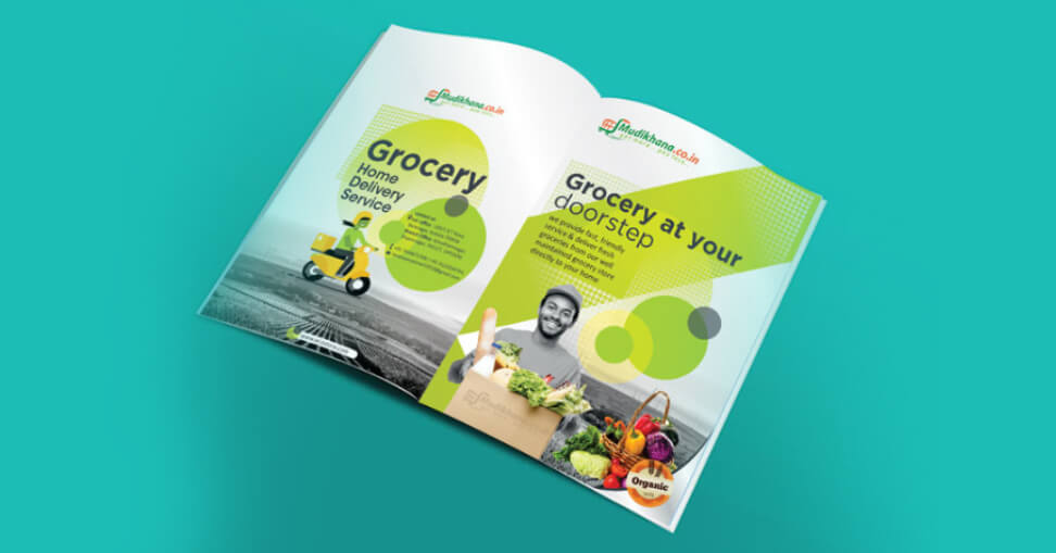
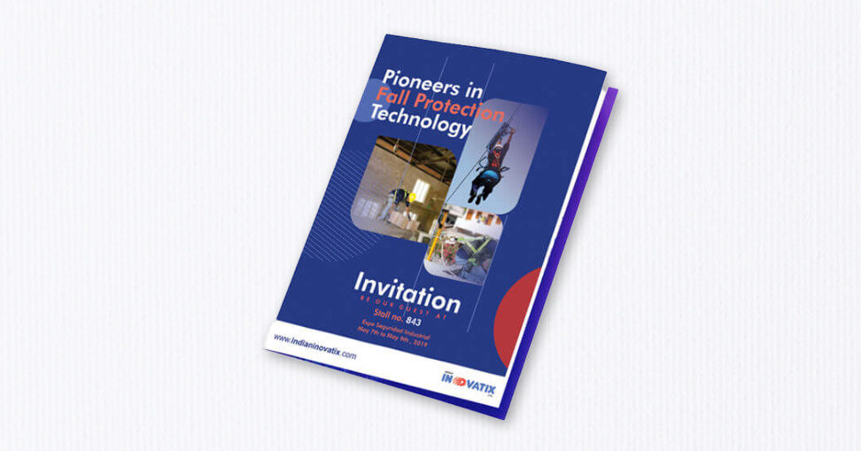
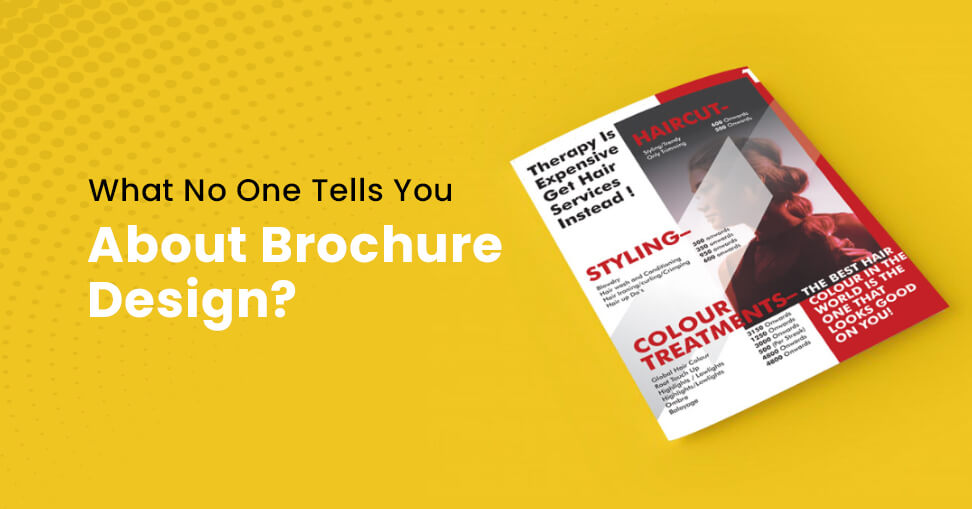
It is a great marketing technique for companies to use brochures to promote a certain product or service. There’s a good reason why it’s so often utilised in marketing.
A lot of information may be crammed into a small package using brochures. Aside from that, it’s perfect for usage in both print and digital media.
In addition, customers are more likely to believe print ads when making a purchase choice. Using the help of this post by a trusted brochure design company, Next Screen Infotech, you’ll learn what no one tells you about brochure design.
A Brochure’s Components
A brochure serves three basic functions. That is to serve as a point of reference for potential customers, to create trust and to generate new business opportunities. However, it will only be able to accomplish these goals if it is well-designed and given enough data.
Fold
Brochures may be folded using letter folds, z folds, accordions and half folds. You may utilise the various gaps provided by each fold to separate your material.
Cover
Leaflets are full of information, so you’ll want to balance this up with a brochure cover that’s visually appealing. To entice your readers to continue reading your brochure, utilise an eye-catching mix of pictures and typography.

Branding
As simple as adding your company’s logo and brand colours to the brochure style, you may include your brand identity. Use this to make it simple for your audience to identify your brand and convey it consistently.
CTA
A call to action (CTA) is a way to get your readers to click over from one of your articles to your website or another platform where they may purchase your products or services.
Typography
Your design’s text should be legible so that your viewers can easily read the material. A 12-point font is a good rule of thumb when it comes to writing in 12-point font.
Illustrations
Illustrations are a great way to add visual interest to your brochure or data presentation. Your brochure won’t become too long, thanks to this design feature.
One factor, however, has the potential to negate all the benefits that brochures may provide. Bad design is the term for it. Now, you’ll learn what to do and what not to do while creating a brochure for your company.

Dos
Create an Eye-Catching Cover.
It is human nature to make snap judgements about a book or brochure based on its cover. People are enticed to open the package by the intriguing cover. Create an eye-catching cover, and you’ll be sure your readers will want to learn more about what you have to say.
Know Your Audience.
Decide who you’ll address in your speech. As a result, you will have a better understanding of how to approach your audience.
Don’ts
Text and Other Design Components Should Never Be Crowded Together.
If you don’t do this, your brochure will be visually cluttered, making it tougher for readers to comprehend the content.
The CTA Is Always Going to Be the Star of the Show, So Don’t Forget About It.
Next, you’ll direct your readers to the checkout page. The goal here is to make it as prominent as possible from a visual standpoint. It’s a good idea to use warm colours like red and orange for CTA buttons in order to catch the eye.
Audiences May Mistakenly Believe That You Are Another Brand If You Seem Too Similar to the Competition.
Researching your match and finding out what sort of design they are utilising will help you prevent this.
To Conclude
As a result of using brochures, you may boost your brand’s appeal as well as its worth to your customers. It’s a good addition to your marketing arsenal. Contact the best brochure design company in Kolkata today!
