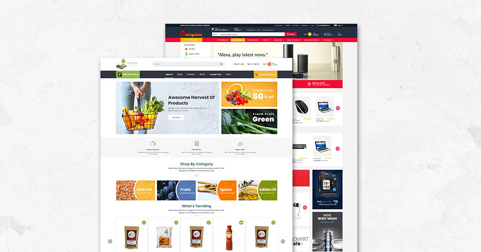
Because of their engaging eCommerce website construction, eCommerce firms are reaching new heights. Online retailers may now quickly reach many potential customers in a short period of time, resulting in maximum sales with minimal expenditure. However, there are a few dangers that you must avoid, having an endless run. Today, we’ll discuss one such stumbling block that, if not addressed, might result in a loss of revenue and, eventually, the closure of your online store. You do not need to be concerned since your eCommerce web design service business will thrive as a result of this blog, generating maximum revenue with minimal expenditure.
The UI/UX design of your eCommerce website is the one problem we’re talking about. Your website’s design may be one of the hidden difficulties that your top website developers must address from time to time. Understand that the most crucial component of your application is the UI and UX design, since setting up an eCommerce website will not increase sales. You will also require SEO company services, such as those provided by Next Screen Infotech, to make a great impression on the audience.

How to Tell Whether Your Ecommerce Store’s UI/UX Design is Hurting It?
Shopping Cart Abandonment
One of the most typical indicators that there is an issue with UI/UX design is when customers add items to their shopping cart but do not complete the transaction. We appreciate that additional variables at the client’s end might lead to the shopping cart being abandoned. The most typical explanation, though, is that the UI/UX design is ineffective.
High Bounce Rate
A bounce rate is the percentage of visitors to a website that leave after reading only one page. If your site’s bounce rate is high, it suggests customers are having trouble discovering what they’re looking for. As a result, while developing an eCommerce website, keep the bounce rate in mind.
These two factors will alert you to the necessity to change your eCommerce website’s UI/UX design.

Ecommerce Website Development Mistakes to Avoid
Avoid Complex Navigation
When talking to eCommerce website developers about your online shop project, make it obvious that you only need a few clicks to complete the purchase. For a user to comprehend, the navigation interface should be straightforward and intuitive. For example, you may include filtering and sorting options so that your consumers can quickly locate the goods they’re looking for. You may also request breadcrumb navigation as part of your eCommerce website construction, since it helps customers find themselves and go to the next page.
Contact Information Is Missing
According to several annual studies conducted by Web Usability reports from time to time. More than 90% of respondents claimed they leave a website because there is “No Contact Information/Phone Number,” which prompts them to do so.
Excluding FAQs and Live Q&A
In its result pages, Google, being the most popular search engine, promotes user-generated content. It allows you to put many keywords on your website in the most organised way possible, allowing you to rank better in the SERPs. Visitors’ live Q&A provides crucial information for conversion. When customers receive prompt answers to their inquiries, your conversion rate % rises. Visit Next Screen.
