Have you ever noticed a well-known brand that didn’t have a logo? Not at all? That is as a result of their absence. Your logo greatly influences customers’ perceptions of your brand. It makes sense that you would want your logo to stand out. How do you get there, though? Everything you need to know to create the ideal logo for you and your company will be covered in this helpful tutorial.
Continue reading to discover how to create a logo, from establishing your brand’s identity and knowing what makes a great logo to selecting the best design options and navigating the design process.
First impressions matter a lot in the digital economy, where visual identity is crucial. In moments, brands have the power to draw in or turn off potential customers. Nowadays, businesses want to be seen as legitimate and noteworthy.
Define Your Business Brand Identity
It serves as a design guide for all of your material, including presentations, blog entries, business cards, and office spaces. It is essential to fully comprehend your business identity before starting the logo design process. Your brand’s principles, soul, and personality should all be graphically represented via your logo. To ensure that your logo properly communicates the goal of your company, a clear mission statement will direct your logo design options.
Decide on your brand’s values: Think about the fundamental ideas that guide the activities and choices made by your brand. Your logo and all other elements of your brand should reflect these ideals. Your audience will recognise and respect your brand values if you include them in the design of your logo. This will strengthen your relationship with them.
Seek Inspiration
Seeing what other firms are doing and getting a sense of the kind of logos you find most appealing might be helpful.
Repositories for logos: Look through resources for logos such as Logoed, Logospire, and Logo Design Love. Examine the opposition: How are companies that are similar using their logos? Looking for a common theme throughout your business might be beneficial.
Determine Logo Style
It’s time to choose your final logo when you’ve had your design polished. Seek input on your completed design from other people. Consult your family, friends, and coworkers for advice. This might assist you in determining any problems that you might need to investigate with your design.
Choose A Logo Type
Imagine NASA, NBC, GE, and HBO. Simple monogram logos aid in brand recall for the business they represent. The name of the firm is shown in a font-based logo known as a wordmark logo (or logotype). Consider Jeep, Disney, and Visa.
- A conceptual logo mark is abstract. It includes a custom-made emblem for your business. There is nothing in the world that your logo is related to, such as an apple or a bird. It’s made to convey how distinctive your brand is. Consider Pepsi, Microsoft, and Airbnb.
- If you don’t have any design skills, making abstract logos might be challenging. Hiring a qualified logo design expert who can transform colours and forms into significant markings for your company is the finest option.
- A mascot logo uses a character to symbolise your company. They are often lively, cartoonish, and entertaining. A mascot logo serves as an ambassador and humaniser for your company.
- These designs should be used by businesses that market to families and children, as well as esports teams.
- A wordmark or lettermark combined with an image mark, abstract logo, or mascot is called a combination mark. After that, you connect them to make the logo.
- Combination marks make it easier for customers to connect your business name to an image or symbol instantly. Burger King, Converse, Ralph Lauren, and Burger King are well-known combination marks

Decide On A Color Scheme
- Colour is a significant factor when making decisions. Up to 90% of purchase choices are made solely on the basis of colour, according to one research, and colour has a significant emotional influence on people, according to another.
- The colours of your logo will appear on your website, in-store signage, marketing emails, social media feeds, and wherever else a customer interacts with your business. While no colour is inherently “better,” every hue conveys a distinct message. Make sure that what you’re saying makes sense.
- Green may evoke an organic atmosphere that reminds one of tranquillity, lush rainforests, and eco-awareness.
- Pink is a delicate, soft hue that is often connected to femininity. Its meanings are more expansive and include romance, compassion, and love.
- Red Red is fearless and ruthless. Because it stands out, it has grown to be a very trustworthy hue for branding. Red seems to evoke romanticism, much as Pink does. Red’s romance, on the other hand, is passionate, loud, and sensual, in contrast to Pink’s gentle and graceful romance.
- Purple is a fascinating, enigmatic stranger who exudes an almost mystical charm. It’s hardly surprising that purple has come to be linked to money, excess, mysticism, magic, and pleasure because purple dyes have always been thought to be rare and costly.
- Blue often evokes sentiments of relaxation, trust, and tranquillity. Nevertheless, research has also found that blue is the least enticing colour. Try to stay away from it if you sell food.
- The majority of logos are one colour. Using only one hue can simplify the other visual design aspects associated with your brand and make it easy to match. Mono logos may also be redesigned with multiple colour schemes to suit various needs.

Pick A Font
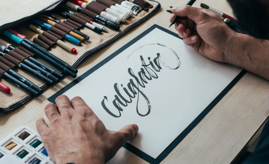
Selecting the right typeface or fonts for your brand is a crucial but often disregarded stage in creating a great logo design. Finding the ideal font is a critical stage of logo creation, even if there are many other essential elements as well, such as selecting the colour and style of your logo. The improper logo typeface may drastically change the message your business is trying to express since different typographies evoke different emotions and moods.
Typefaces with tiny lines or pen strokes dangling from the letters are known as serif fonts. These ornamental lines enhance readability and provide character to the letters, frequently conveying a more refined but understated feel. Serif fonts evoke sentiments of institutional reputation and allude to a more historical experience.
Fonts lacking “serifs,” or the little brush strokes that dangle off the extremities of letters, are known as sans serif fonts. These fonts tend to seem a little bit more angular and tidy, and because of their simplicity, pairing them with other, more striking typefaces is made simpler. Helvetica, Frutiger, Futura, proxima nova, and kerning are a few popular sans serif fonts.
Using eye-catching and distinctive typefaces is a terrific method to draw in customers and establish your brand’s identity. Think stencils, glyphs, and other visually striking letterforms when designing futuristic, vintage, geometrically varied, or funky logo fonts. However, they should only be the main element of a straightforward logo design; combining display fonts with other typefaces may be difficult and might result in a disorganised and unclear logo for your company. It is recommended to utilise display typefaces sparingly when designing highly memorable logos.
Outline A Logo Shape
The final logo design’s form is just as crucial as the text and colour scheme you choose. Whether it’s a square or a circle, our subconscious minds react to forms differently. The following are some typical logo forms and their possible meanings:
- Ovals and circles: Anything round conveys a good vibe, generally about love, friendship, and community.
- Squares: Squares are symbolic of stability and pragmatism. They also convey power and balance, but watch out because when used with a monochromatic colour scheme, they might come off as icy and unwelcoming.
- Triangles: Triangles are often connected to power and science and are said to represent the characteristics of men.
- Who would have thought that lines, both vertical and horizontal, could express so much? Subconsciously, we see horizontal lines as calming and community and vertical lines as power.

Fine-Tune Your Logo Design
Everybody’s creative process is unique. While some could begin with drawings, others would launch Adobe Illustrator straight away. You will eventually begin to feel as if you are unable to distinguish letters from shapes or excellent logos from poor. It could be time for input at that point. Since it’s the only way for artists to “test” their ideas, feedback plays a crucial role in the creative process.
Conclusion
Naturally, whether your business produces sophisticated high-end wine with an elaborate label or a high-tech app that runs on peoples’ phones, your demands and expectations for a logo will be quite different from those of a company that sells children’s apparel and requires a basic emblem that can be sewed into the fabric.
When creating your logo, remember to stand back and think about the wider picture. This is about what works best for your business, not about personal preference.
