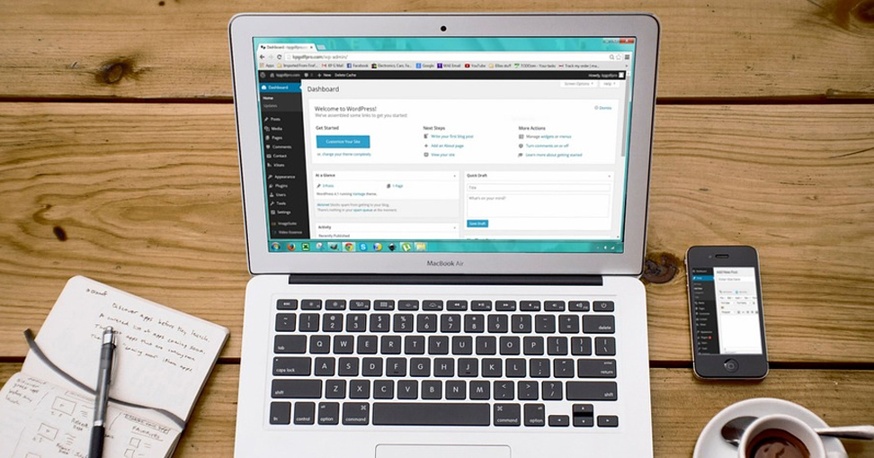
Did you know that Google advises optimising blogs for mobile to help them rank higher? In 2021, mobile traffic has again surpassed desktop traffic, and this trend is expected to continue for decades. People are increasingly utilising their mobile devices, and they want you to make it simple for them to visit your website.
Most people have optimised their websites in some form, but have you done anything, especially for mobile visitors? Many websites aren’t mobile-friendly beyond a basic responsive layout. Moving your site’s layout around for tiny screens isn’t enough to keep your mobile users engaged and convert. You must ensure that your mobile site is quick, simple to use and optimised for small displays.
You can avoid that happening on your site and optimise the WordPress website for mobile users by following this super helpful guide by the best WordPress development company:
Mobile-Friendly Test by Google
The first tool is a Google product that is really easy to use. Open your browser, go to Google Mobile Friendly Test, and type in the URL of your website before clicking “Analyze.” It will inform you whether your website is mobile-friendly or not after a quick inspection. If your website is mobile-friendly, you’ll see a green notification.

Improve the Performance of Your Mobile Website
Start with the most crucial thing you can do: Speeding up your site. On mobile, people want sites to load quickly, especially when they’re on the go. Slower load times will drive customers to your rivals, whereas faster load times will improve conversions and minimise bounce rates.
Here are three things you can do today to make your site mobile-friendly:
- Reduce the Number of Images
Large pictures might significantly slow down the loading of your page. The good news is that it’s a rather simple repair. The first step is to go through your website’s pages and remove any pictures that aren’t absolutely essential. If the only purpose of your photos is to make your site seem nice, they aren’t likely to convert your visitors to customers. - Optimise Plugins and Themes
Even if you optimise everything else, a bad plugin and theme code might cause a bottleneck in your site’s performance. If you notice a significant delay, consider updating your themes, plugins and the WordPress core. - Choose an Excellent Web Hosting Service
If you’re on a low-cost shared hosting server elsewhere, just increasing your hosting account can make a huge difference. The best WordPress development company, like Next Screen Infotech, has managed WordPress hosting with server structure and caching in place that will significantly speed up your site.
Buttons for Social Sharing
Although there are many social sharing plugins for WordPress, not all of them are suited for mobile use. Most of them enable you to place social sharing buttons above, below, as a floating sidebar or all of the above to encourage people to share your content.
Enable Google Accelerated Mobile Pages (AMP)
PageSpeed (of web pages) has long been a component in Google’s search algorithm. Furthermore, whether for PC or mobile users, Google constantly pushes for a perfect user experience. For the same reason, they launched Accelerated Mobile Pages (AMP), which attempts to make a mobile-friendly website by making web pages load quicker on mobile devices.

Avoid Using Full-Screen Pop-Ups
Stop utilising full-screen pop-ups, which is the next recommendation on this list for making a mobile-friendly website/blog. Full-screen pop-ups with a call to action for your website may be an effective method to engage desktop users. However, mobile users may find these pop-ups irritating.
One big explanation for this might be because these full-screen pop-ups aren’t built for mobile browsers, which they aren’t in many situations. Your consumer may have a negative experience as a result of this.
Consider adding some CSS or JavaScript code if you need to use these pop-ups for desktop content. This will detect the user’s browser type and prevent the pop-ups from appearing for those who are surfing on a mobile device.
Final Thoughts
This guide for optimising your WordPress website for mobile users should start you moving in the right direction. However, simply changing your theme or adding a mobiliser plugin isn’t enough. It was suggested that you keep track of your site’s performance on both mobile and desktop at all times. This will allow you to understand the precise user experience that your visitors are having.
Do you wish to get more details on the latest trends? Connect with the top WordPress development company – Next Screen Infotech.
