Creating a great marketing brochure is an art form that grabs attention, piques interest, and invites action—more than just a mix of typefaces and colours. Sounds intricate? It isn’t exactly as stated here. You are at the perfect spot whether you are yelling about your company, advertising an event or supporting a cause.
So stay with us as we walk you through the nuances of colour palettes, clever layouts, and persuasive messages enabled by our Brochure Maker. Let’s get right to improve your brochure game for graphic design company in Kolkata!
Audience and Goal
Making a brochure calls for two main components: the objectives of the brochure and the audience you want to target. These guide the design and content to guarantee your message connects powerfully.

Select a Brochure Style
It would help to choose an appropriate brochure style that fits your target and message. Think of forms like bi-fold, tri-fold, or a booklet style. Every format has a different layout and space allocation that could influence the impression of your work.
Describe The Content Structure
Your brochure’s content organisation should be well established. Start by deciding which essential ideas you want to address. Arrange them logically using headings, subheads, and bullet points to help your reader move around the brochure.
Content Generation
Developing a brochure that grabs attention and guides efficiently calls for a systematic approach to content creation. Your primary focus should be creating concise, transparent, exciting material reflecting your business’s value proposition and messaging.
Select Fonts And Colours Scheme
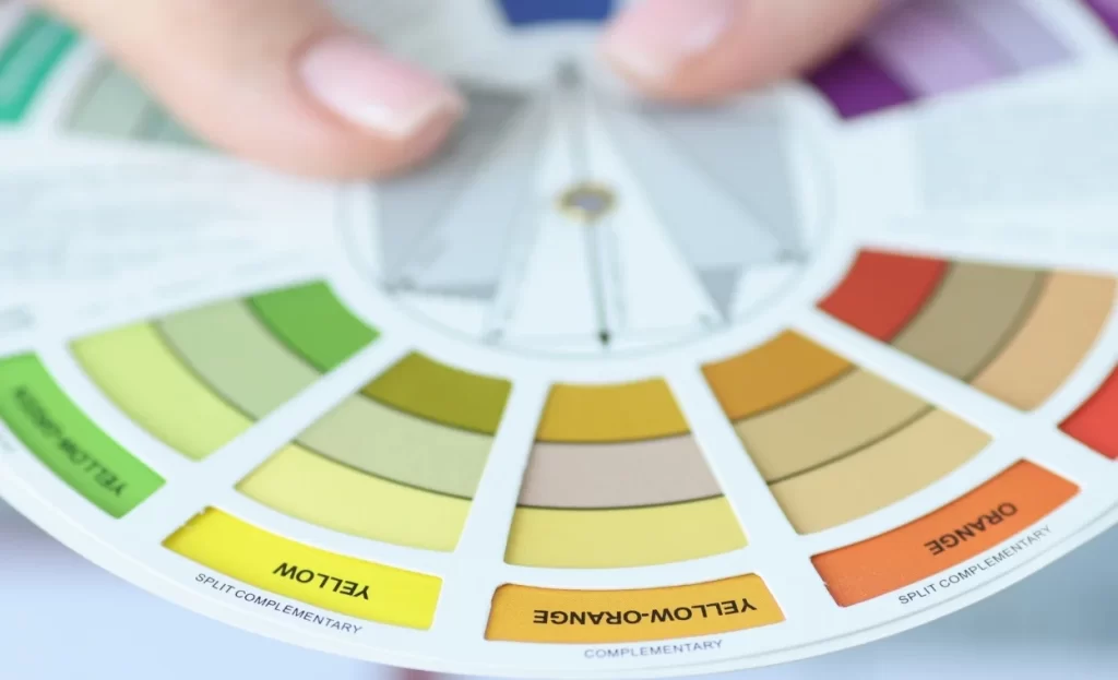
Choose a colour pallet for consistency that fits your brand. Restining oneself to two or three primary colours could increase brand awareness. Regarding typefaces, try for ones that match the personality of your business and improve readability. Use no more than two font families to keep everything looking cohesive.
Organise Components for Easiness of Use
The efficacy of your brochure relies on how quickly information is absorbed—Centre essential messages to give them priority.
- To dissect complex material, use lists or bullet points.
- Images and visuals should complement rather than take the front stage for text.
- Keep constant margins and padding to produce an aesthetically pleasing, simple-to-use arrangement.
Design Suited For Print And Digital Consumption
Think about the experience of the end user in print and digital forms:
- Print: Ensure your design fits typical brochure dimensions and include bleed for edge-to-edge printing.
- Digital: Check many devices for screen readability and ensure your brochure can be quickly sent or shared.
Making
Your decisions directly affect the quality and cost of a brochure produced. Choose your materials carefully, and always check your prototypes before mass production.

Create Prototypes Using Printing
Test many prototypes before committing to a whole print run. This lets you evaluate, in a physical form, the colour accuracy, readability, and general design. Look for mistakes or misalignments, then obtain comments to ensure your brochure satisfies your expectations.
Finalise for Mass Printing
Once you are happy with the prototype, get ready for mass production on your brochure. Verify the desired amount and make sure your file follows printer guidelines. This covers resolution needs, margin rules, and bleed settings. Choose dependable printing companies that fit the requirements of your project regarding quality and timing.
Strategies for Distribution
Making a good brochure requires carefully considering how you will distribute it to your target audience. To hone your strategies, you must choose efficient distribution routes, use digital sharing tools, and monitor replies.
- Schedule for Digital Exchange.
- Brochures may transcend beyond the tangible in the digital era. Think about these habits:
- Electronic Brochures: Generate an email version of a PDF.
- Social Media: Distribute your brochure on sites your target market visits.
- Make the brochure downloadable on your page.
- Track Engagement and Reaction.
- Your brochure’s success will depend on how well it is received. Using tracking techniques like:
- QR codes enable you to evaluate your digital brochure access.
- Tracks visitors to your website using the brochure under unique URLs.
- Direct answers from your audience should be gathered for development on feedback forms.
Conclusion
With essential tools like Microsoft Word or Google Docs, students may quickly produce brochures emphasising content over design intricacy. Emphasise clarity by employing bullet points and images to guarantee the brochure is aesthetically pleasing and educational.
Even without sophisticated design knowledge, various online programs for brochure creation—like Adobe Express and Piktochart—which provide a range of layouts and graphic elements—offer professional-looking brochures. For more details consult with the best graphic design company in Kolkata.
