
Regarding website design, your website may be anything from stylish to minimalistic, from fun and vivid to sleek and futuristic, depending on your style and direction. Although your final look and feel should reflect your style, field of business, and website design company brand identification, a few fundamental principles apply, always independent of whether you are redesigning your website or building a new one.
Though initial sight seems simple, excellent site design flows into your user experience and functionality. Whether it feels ready for a website makeover or not, the five basic website design ideas below—for many more, see website design best practices—will help you learn how to create a website practical and appealing:
A Single-Page Web Design Future
According to Cognitive Market Research, the global web design market will reach USD 56.8 billion in 2024. It then increases at an 8.50% compound annual growth rate between 2024 and 2031. Apart from this development, single-page web design has bright prospects. We see more companies and designers choosing this simple and quick design approach in the future.
The five single-page web design ideas you should give top attention to
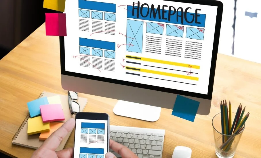
1. Keep your homepage basic and clutter-free
The homepage of your website should rapidly convey your fundamental point of view. We seldom, after all, read every word on a website. Instead, we rapidly scan the page for essential words, phrases, and pictures. Given these well-known habits, appealing to emotions makes more sense than stressing word count.
Fewer site visitors need to read, click on, or remember, which will help them better understand and assess your material. Designing for declining attention spans (in line with web design statistics) and aiming for a contemporary website design can help people accomplish their desired goals.
These basic website design ideas will enable you to divide your material and create a presentable and attractive homepage design while learning how to build a website:
Keep valuable material above the fold. Without clicking or scrolling anywhere, visitors should know right away what your website is all about.
Space your material apart. Use whitespace to separate items. Leaving specific spaces unfilled will help the design to have much more room and balance. Regarding your text, craft readable, bite-sized paragraphs.
Put a call-to-action (CTA) button on the homepage of your website to inspire site visitors to behave as you planned, from purchasing to registering.
2. Remember visual hierarchy in the design
One fundamental design concept that will enable a clear and compelling presentation of your material is hierarchy. Starting with the most essential element, you can adequately use hierarchy to guide site users’ attention to specific page components in order of importance.
Emphasize your best assets—that of your website design company name and logo—by enlarging and more visually striking their appearance. Readers often start with big, solid headers and then go on to smaller paragraph material organically.
3. Current Modern
Element alignment: Ensure your website’s style guides visitors’ gaze in the correct path. For example, you may put your logo at the website top or centre a crucial call-to-action button on the screen’s middle.
Strips or grid layouts, including those of the Wix Pro Gallery, are great web design tools that assist you in attaining a solid visual hierarchy. See our designer-made website templates for additional ideas and inspiration; learn how to create an irresistible website by reading about this. Write straightforward, readable online content.
Readability gauges people’s ease of recognizing words, sentences, and phrases. Users of your site can quickly scan or skim-read over it when its readability is good. In this sense, absorbing the knowledge comes naturally.
4. Make sure your website makes sense
Although you may naturally defy the rules, website navigation is not the area for avant-garde expression. After all, you want your users to locate what they are searching for quickly. Furthermore, one approach to combine your website design with SEO is to make sure search engines index your material while significantly enhancing the user experience using good navigation:
Link your logo to the front page. Your visitors will anticipate this standard website design approach, which will help them save valuable clicks. If you still need one, you are strongly advised to design your logo as part of your branding initiatives.
Check your menu: Whether you choose a hamburger menu, a conventional horizontal list, or anything else, your website menu should be clear and conspicuous.
5. Keep yourself mobile-friendly
No matter the device they are using, every site visitor should be able to experience your professionally created website at its best. Wix automatically generates a mobile-friendly version of your website while developing it so you can stay up with the more mobile environment.
Conclusion
The ignorance of user behaviour and lack of feedback collection could stop continuous development. Use analytics tools, poll users, and aggressively seek comments to pinpoint areas that need work.